

When someone lands on your website or scrolls by your post, the first thing they notice isn’t your logo or tagline…it’s your colors.
The hues you choose set the tone for your brand, shape how people see you, and make your business instantly recognizable.
A well-thought-out color palette isn’t just about looking pretty. It’s about creating connection, consistency, and trust. Let’s talk about why your brand colors are one of the most powerful tools in your brand toolkit.
1. Visual Consistency = Trust
Your colors are like your brand’s signature.
When you use them consistently across your logo, website, social media, and packaging, you create a unified visual identity that people remember.
That consistency builds recognition — and recognition builds trust.
Think of your favorite brands: you could probably spot their content without seeing their name. That’s the power of visual consistency.
2. Standing Out in a Crowded Market
In a world full of lookalike brands, color helps you stand apart.
Take McDonald’s, for example — their bold red and yellow combo isn’t just attention-grabbing, it’s strategic. Red sparks energy and appetite, while yellow feels warm and welcoming.
Together, they create an unforgettable experience (and make you crave fries just thinking about it).
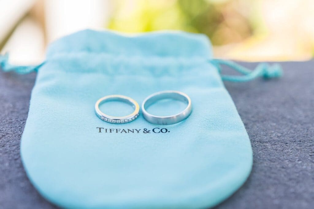
Or think of Tiffany & Co. — that iconic Tiffany Blue instantly communicates sophistication, exclusivity, and timeless elegance. You don’t even need to see the logo to know who it is.
3. Color Creates Emotion
Color is emotion in visual form.
It tells your story, sets the mood, and connects with your audience before you ever say a word.
Rolex, for instance, uses deep green and gold — colors that evoke prestige, tradition, and luxury. These shades aren’t random; they reflect the brand’s commitment to excellence and craftsmanship.
Your brand colors should do the same — speak to your values and make your audience feel something.

4. Speak Your Audience’s Language
Different colors resonate with different people.
Bold, vibrant tones might attract younger, creative audiences. While muted, classic hues often appeal to more established or luxury-driven clients.


When you understand your audience and choose colors that match their energy, you create a natural connection that feels aligned and intentional.
5. Timeless Brands Think Long-Term
Trendy colors come and go, but strategic palettes stand the test of time.
A timeless brand color palette adapts easily to new designs, seasons, and trends. Keeping your brand feeling fresh without losing its core identity.
Think of your color palette as an investment that grows with your brand and never goes out of style.
Avoiding the need for frequent overhauls.
6. Tell a Cohesive Brand Story
Color is one of the most powerful storytelling tools you have.
It sets the mood, evokes emotion, and helps people instantly understand your brand personality.
When your colors are consistent and intentional, they tie every piece of your brand together. From your website to your social posts to your client experience.
💎 Final Gem
At Sapphire Creative Co, I believe your brand colors should be felt not just seen.
I craft custom palettes that reflect your personality, captivate your dream clients, and make your brand unforgettable.
xo Joelle
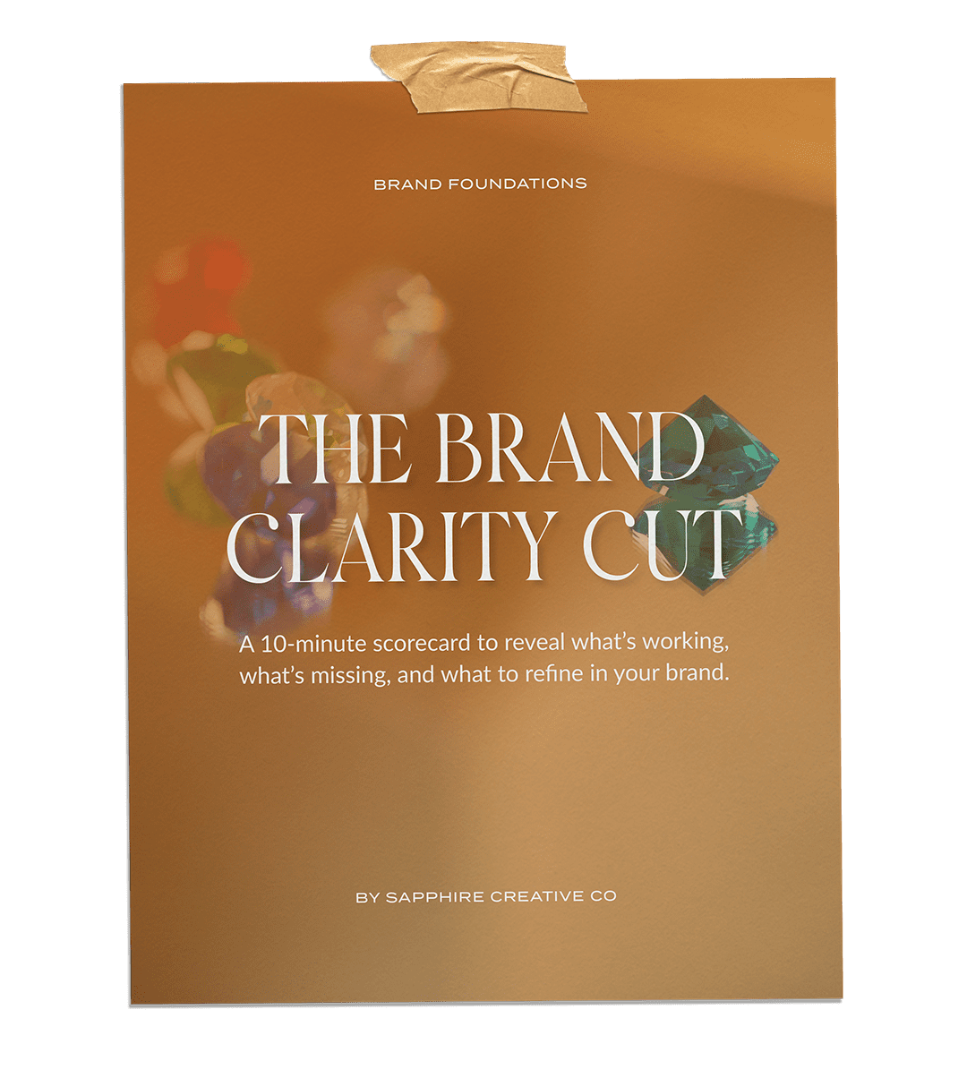
Free 10-Minute Audit
The Brand Clarity Cut
A guided brand scorecard to uncover what’s working, what’s missing, and what to refine.
✨ Grab your free audit now and take the first step toward a brand that feels clear, cohesive, and confidently you.