In this blog post, titled ‘Your Brand Colors Make a Huge Impact: Here’s Why,’ we will delve into why having a brand color palette is not just a choice but a vital element for achieving success in the competitive landscape.
First impressions are crucial in branding, so the colors you choose matter. A well-designed color palette is important for a brand. It shapes how people see the brand and helps them remember it.
It also helps the audience connect on a deeper level.

Visual Consistency: A Unified Brand Identity
A well-defined color palette provides visual consistency across all brand touchpoints. A brand’s identity is reinforced by using the same colors in its logo, website, social media, and packaging. Having a consistent look and feel helps customers recognize and remember the brand. This builds trust and loyalty in the long run.
Brand Colors help you Stand Out in the Crowd
In a saturated market, standing out is a constant challenge.
A distinctive brand color palette sets a brand apart, creating instant recognition. Think about the golden arches of McDonald’s
McDonald’s iconic color palette of red and yellow isn’t just eye-catching; it’s a strategic brand powerhouse. The bold red exudes energy and appetite stimulation, while the vibrant yellow signifies warmth and friendliness.
This winning combination creates a memorable and appetizing experience, making McDonald’s instantly recognizable worldwide.
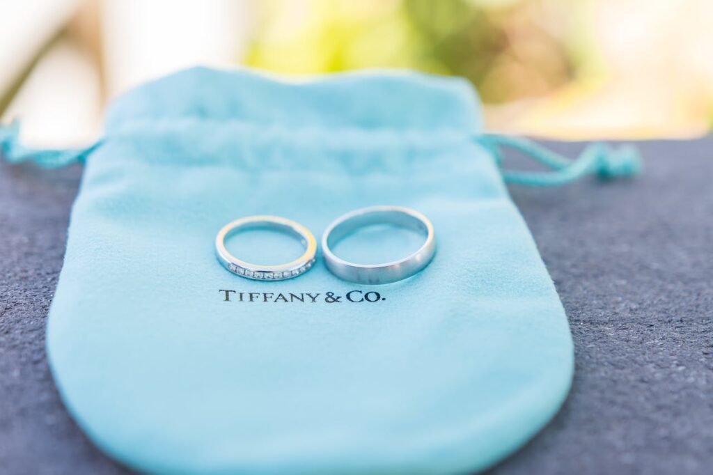
Tiffany & Co.’s celebrated color palette revolves around the iconic Tiffany Blue.
This distinctive shade of robin’s egg blue symbolizes sophistication, exclusivity, and timeless elegance. The carefully curated color evokes a sense of luxury, making every Tiffany box an embodiment of refined style and coveted beauty.
Emotional Connection through Your Brand Colors
Colors wield the power to evoke emotions and shape perceptions, offering a visual language for a brand’s personality and values.
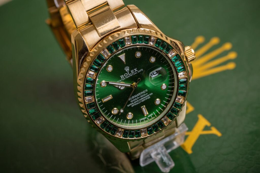
Consider the opulence of Rolex’s green and gold palette, where deep greens evoke prestige and gold signifies luxury.
These carefully chosen colors foster a profound emotional connection, reflecting the brand’s commitment to timeless elegance and unparalleled craftsmanship.
Speaking the Language of Color
Different demographic groups respond to colors in distinct ways. Creating a color palette that matches the audience’s preferences makes it easier for them to relate.
For instance, vibrant and bold colors might appeal to a younger audience.
While muted and classic tones may resonate with a more mature demographic.
Your Brand Colors are Timeless Investment
A well-constructed brand color palette is versatile and adaptable. It stands the test of time, remaining relevant across various trends and seasons.
This adaptability ensures that the brand’s visual identity remains fresh and timeless.
Avoiding the need for frequent overhauls.
Using Color for a Cohesive Brand Storytelling
Colors can serve as powerful storytelling elements within a brand. From the initial impression to the user experience. A cohesive color palette helps tell a consistent and compelling brand story.
Each color contributes to the narrative, creating a holistic and memorable brand experience.
a Competitive Edge with Brand Colors is a huge impact
Having a unique brand color palette gives a competitive edge in a crowded market. Being unique is important for a brand. It helps it stand out from competitors and be remembered.

A brand color palette is not just about aesthetics; it’s a strategic business asset.
It influences how people see and remember a brand, and connects with them emotionally. From the first glimpse to a long-term relationship, the colors chosen define a brand’s journey.
When creating a brand identity, remember that the color palette is important. It represents the brand’s essence and can lead to success.
At Sapphire Creative Co, we understand the art of uniqueness – crafting color palettes that aren’t just seen but are felt, leaving an indelible mark on the canvas of your brand’s journey.
Embrace the power of COLOR

Hey There!
I think I have a knack for design and I know I have an obsession with typography. I can get a little antsy when I’m not creating and I live for Branding and Website Design. Join me here at Little Gems Blog and let’s bring visions to life!

or

